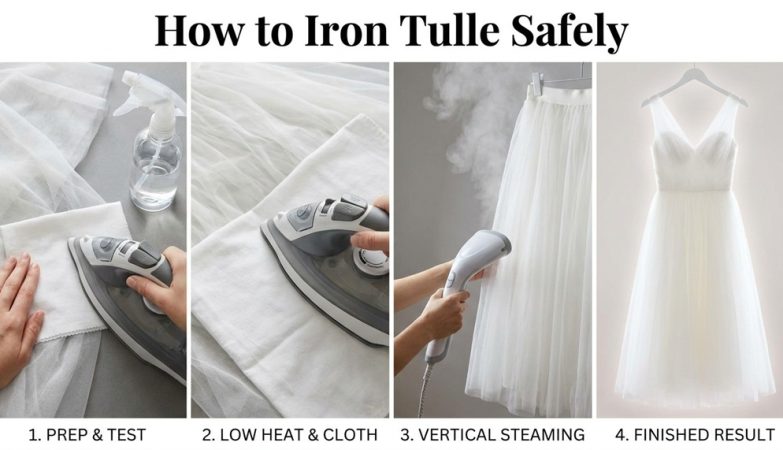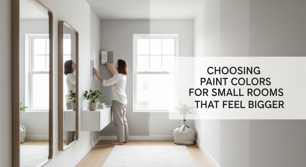
Small rooms often feel cramped not because of their size, but because of how color interacts with light, contrast, and visual boundaries. The wrong paint shade can shrink a room instantly. The right one can make it feel wider, taller, and calmer without moving a single wall.
This guide explains how professionals choose paint colors that make small rooms feel larger. You will learn what shades work, what finishes matter, how lighting changes perception, and how to avoid mistakes that reduce visual space.
What paint colors make small rooms look bigger?
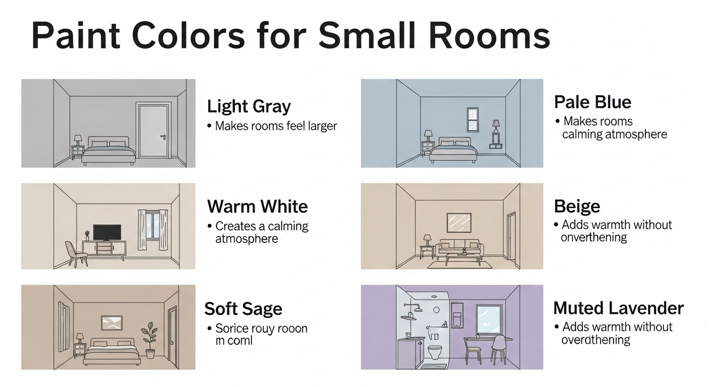
Snippet Answer: Light-reflective paint colors such as soft whites, pale grays, muted blues, and warm neutrals make small rooms appear larger by increasing brightness, reducing contrast at edges, and visually extending wall boundaries. Consistent color flow across surfaces prevents visual interruptions that make spaces feel confined.
Answer Block: Light-reflective colors like soft white, pale gray, light beige, and muted blue visually expand small rooms by increasing brightness and reducing harsh visual boundaries. Using low-contrast color transitions between walls, ceilings, and trim creates continuity that makes spaces appear wider and more open.
Professional designers rely on color reflectance value (LRV) when selecting paint for compact spaces. Higher LRV shades reflect more light back into the room, increasing perceived openness.
Soft whites remain the safest option because they adapt to different lighting conditions. However, pale warm neutrals often outperform pure white in rooms lacking sunlight.
Muted blue tones create atmospheric depth. This produces a subtle illusion that walls sit farther away than they actually are.
Low-contrast palettes prevent visual breaks. Strong contrast between trim and walls divides surfaces into smaller sections, making rooms feel tighter.
- Soft white increases brightness without glare
- Warm beige adds comfort without shrinking space
- Pale gray creates modern openness
- Dusty blue adds depth perception
Why do darker paint colors sometimes work in small rooms?
Answer Block: Dark paint colors can make small rooms feel larger when used correctly because they blur corners and reduce visible boundaries. Deep tones absorb contrast between surfaces, creating visual continuity that makes walls appear less defined and therefore farther apart.
Many people avoid dark paint in compact rooms. That assumption ignores how visual perception works.
Darker shades hide edge definition. When corners become less visible, the brain struggles to measure room size accurately. This creates the illusion of expanded depth.
Charcoal gray, deep navy, and forest green can work especially well in bedrooms and reading areas.
Matte finishes improve this effect by preventing light reflection that exposes wall edges.
Dark paint performs best when combined with:
- Light ceilings
- Minimal trim contrast
- Strategic lighting placement
- Mirrors or reflective décor
Instead of shrinking the room, deep tones create a continuous envelope that removes visual interruptions.
Should ceilings be lighter than walls in small spaces?
Answer Block: Painting ceilings slightly lighter than walls increases perceived height by drawing the eye upward. This technique reduces the boxed-in feeling common in small rooms and creates a vertical expansion effect without structural changes.
Ceiling color plays a larger role than most homeowners realize. The ceiling defines the visual top boundary of a room.
When ceilings appear higher, the entire space feels larger.
A lighter ceiling reflects overhead light downward. This brightens upper wall areas and prevents shadow buildup near corners.
However, matching ceiling and wall colors can also work in narrow rooms. This removes the horizontal break line entirely.
Choose the approach based on room proportions:
- Low ceilings benefit from lighter paint overhead
- Narrow rooms benefit from same-color walls and ceiling
- Square rooms benefit from subtle tonal contrast
Even a small brightness shift between surfaces can noticeably change spatial perception.
How does natural light affect paint color in small rooms?
Answer Block: Natural light changes how paint colors appear throughout the day, influencing brightness, warmth, and depth perception. Selecting shades that respond well to the room’s light direction ensures walls reflect illumination efficiently and maintain an open, balanced appearance.
Light direction determines whether a color looks warm, cool, bright, or dull.
North-facing rooms receive cooler light. Warm neutrals prevent these spaces from feeling flat.
South-facing rooms receive strong daylight. Soft grays and muted blues prevent visual glare.
East-facing rooms appear brighter in the morning. Balanced neutral tones maintain consistency.
West-facing rooms feel warmer later in the day. Pale greens and creams stabilize color shifts.
| Room Direction | Recommended Colors | Effect |
|---|---|---|
| North-facing | Warm beige, cream | Add warmth |
| South-facing | Soft gray, pale blue | Control brightness |
| East-facing | Neutral white | Balance morning light |
| West-facing | Light sage | Reduce evening warmth |
Testing paint at multiple times of day prevents unexpected results after application.
Is using one paint color throughout a small home effective?
Answer Block: Using a single paint color across connected small rooms improves visual continuity and reduces spatial breaks. This technique allows the eye to travel smoothly between areas, making the overall home feel larger and more cohesive.
Visual interruptions shrink perceived space faster than wall color itself.
Consistent paint creates uninterrupted sightlines between rooms. This makes hallways appear longer and adjacent areas feel connected.
Interior designers often apply a single neutral tone throughout compact apartments.
Accent colors then appear through furniture and décor instead of walls.
This strategy works especially well for:
- Studio apartments
- Small bedrooms
- Narrow hallways
- Compact living areas
Consistency reduces cognitive boundaries. As a result, rooms feel less segmented.
What paint finishes help small rooms feel larger?
Answer Block: Paint finishes with slight reflectivity, such as eggshell and satin, help small rooms appear larger by bouncing light across surfaces. These finishes enhance brightness without creating glare, improving depth perception and visual openness.
Finish selection affects light distribution more than color alone.
Flat paint absorbs light. This can reduce perceived space in dim rooms.
Satin finishes reflect controlled amounts of light, increasing brightness evenly.
Eggshell finishes offer the best balance between softness and reflection.
Use this finish guide when painting compact areas:
- Ceilings: Flat or matte
- Walls: Eggshell
- Trim: Satin
- Doors: Semi-gloss
Layered finishes create subtle contrast without breaking visual continuity.
Which accent wall strategies work best in small rooms?
Answer Block: Accent walls can expand perceived depth when placed strategically on the farthest wall in a room. Using slightly darker shades than surrounding walls draws the eye forward and creates the illusion of extended distance.
Accent walls must be placed carefully in compact spaces.
The goal is depth, not contrast.
A darker tone on the far wall stretches perspective. This makes rectangular rooms feel longer.
A lighter accent wall behind furniture highlights focal points without overwhelming space.
Avoid high-contrast accent walls in square rooms. These shorten visual depth.
Effective accent wall placements include:
- Behind a bed headboard
- At the end of narrow hallways
- Behind a sofa
- Opposite entry points
Proper placement enhances structure instead of reducing openness.
What common paint mistakes make small rooms feel smaller?
Answer Block: High-contrast trim, overly dark ceilings, multiple wall colors, and low-reflective finishes can make small rooms feel tighter by increasing visual segmentation. Minimizing contrast and maintaining consistent tones preserves spatial continuity and improves perceived openness.
Most space-reducing mistakes come from contrast overload.
Dark trim outlines room edges clearly. This highlights boundaries instead of hiding them.
Multiple wall colors divide rooms into smaller zones.
Glossy walls create glare that exaggerates surface irregularities.
Avoid these errors:
- Bright white trim with dark walls
- Dark ceilings in low rooms
- More than two wall colors per room
- Flat paint in low-light areas
Reducing contrast preserves visual flow and improves scale perception.
Conclusion: How can the right paint color transform a small room?
Paint color controls how space is perceived before furniture placement begins. Light-reflective tones increase brightness. Consistent palettes remove visual barriers. Strategic darker accents create depth where needed.
Ceiling color influences height perception. Finish selection improves light movement. Accent wall placement adjusts spatial direction.
When these techniques combine correctly, even compact rooms feel balanced and open.
Start by identifying your room’s light direction. Choose a high-LRV neutral tone. Keep trim contrast minimal. Use eggshell finishes for walls. Test paint samples before committing.
These small decisions produce large visual improvements without renovation costs.
If you are planning to repaint a tight space soon, apply one strategy from this guide first. Even a single adjustment can noticeably increase openness.
Frequently Asked Questions
What is the best white paint for small rooms?
Soft whites with warm undertones work best because they reflect light without creating glare. These shades maintain brightness while preventing the sterile appearance that pure white sometimes produces in compact spaces.
Do cool colors make rooms look bigger?
Yes. Cool colors such as pale blue and soft gray create atmospheric depth. This effect makes walls appear farther away, increasing perceived space in smaller rooms.
Should trim match wall color in small rooms?
Matching trim to wall color reduces visual contrast and helps surfaces blend together. This technique improves spatial continuity and makes rooms appear larger.
Is glossy paint good for small rooms?
Glossy paint reflects too much light and highlights wall imperfections. Eggshell or satin finishes provide better brightness balance without visual distraction.
Can two colors be used in a small room?
Yes. Use closely related tones rather than high-contrast combinations. Subtle variation maintains depth without dividing the space visually.
Do darker floors make rooms feel smaller?
Darker floors can work if wall colors remain light. Contrast between surfaces helps anchor the room while maintaining vertical openness.
How many paint colors should a small home have?
Limiting the palette to one primary wall color with two supporting tones creates cohesion. This improves flow between rooms and increases perceived size.
Read More Also: How to Style a Dining Room Table
Find out: Three common knitting mistakes to look out for